Role
UX Designer
Team
4 UX Designers, 1 UX Researcher
Timeline
8 weeks, 2021
Skills
UX/UI design, visual hierarchy, UX research, research analysis, user interviews, usability testing, prototyping, wireframing
Challenge
The IBM Accessibility team aimed to modernize an outdated demo website to better showcase the value of the IBM Equal Access Accessibility Checker, a Chrome extension that helps users evaluate website accessibility.
Solution
Our solution was a web experience that featured a redesigned demo website and enabled users to explore assistive technologies, helping them better understand how clients with diverse needs interact with and navigate digital interfaces.
impact
💥 Redesigned demo website is now actively used in recurring team and office hour sessions with 40+ attendees
💥 Delivered robust final design in 2 weeks
💥 Conducted 17 user interviews with 12 users over 2 weeks
background
The IBM Accessibility team offers resources like the Equal Access Toolkit, which helps designers, developers, and teams build more accessible digital products. One key tool is the Accessibility Checker, a Chrome extension that scans web pages and applications for accessibility issues.
However, the original demo website used to showcase the Checker was outdated and didn’t reflect modern web practices, leading to client and developer hesitation around adopting the tool in real workflows.
Our design task
How might we show off the IBM Accessibility Checker in a way that appeals to potential users at a glance?
ReSEARCH
We began by defining our research goals, which we refined into two key research questions.:
What is the current state of accessibility in the industry?
What is the experience of designing for accessibility like for typical developers?
Our primary and secondary research resulted in 17 interviews with 12 users and 3 competitive analyses.
Key insights
🚀
Lack of incentives
A lack of incentives, not interest, inhibits developers from learning about and implementing accessibility. They want to develop quickly.
🚀
Lack of awareness
Accessibility errors stem because people don’t know what it’s like to use assistive technologies, let alone design for them.
🚀
Accessibility Checker tool is too technical
High-level executives and non-technical clients are more interested in summaries than detailed reports.
Personas
Our research led us to identify two user personas: marketers and developers. Both have different processes and needs when it comes to accessible design.
Andie
A marketer who faces middle management-level clients and promotes the use of the IBM Accessibility Checker.
Alex
An “average” developer not well-versed in accessibility and wants to develop for it, yet still prioritizes timeline.
Prioritization grid
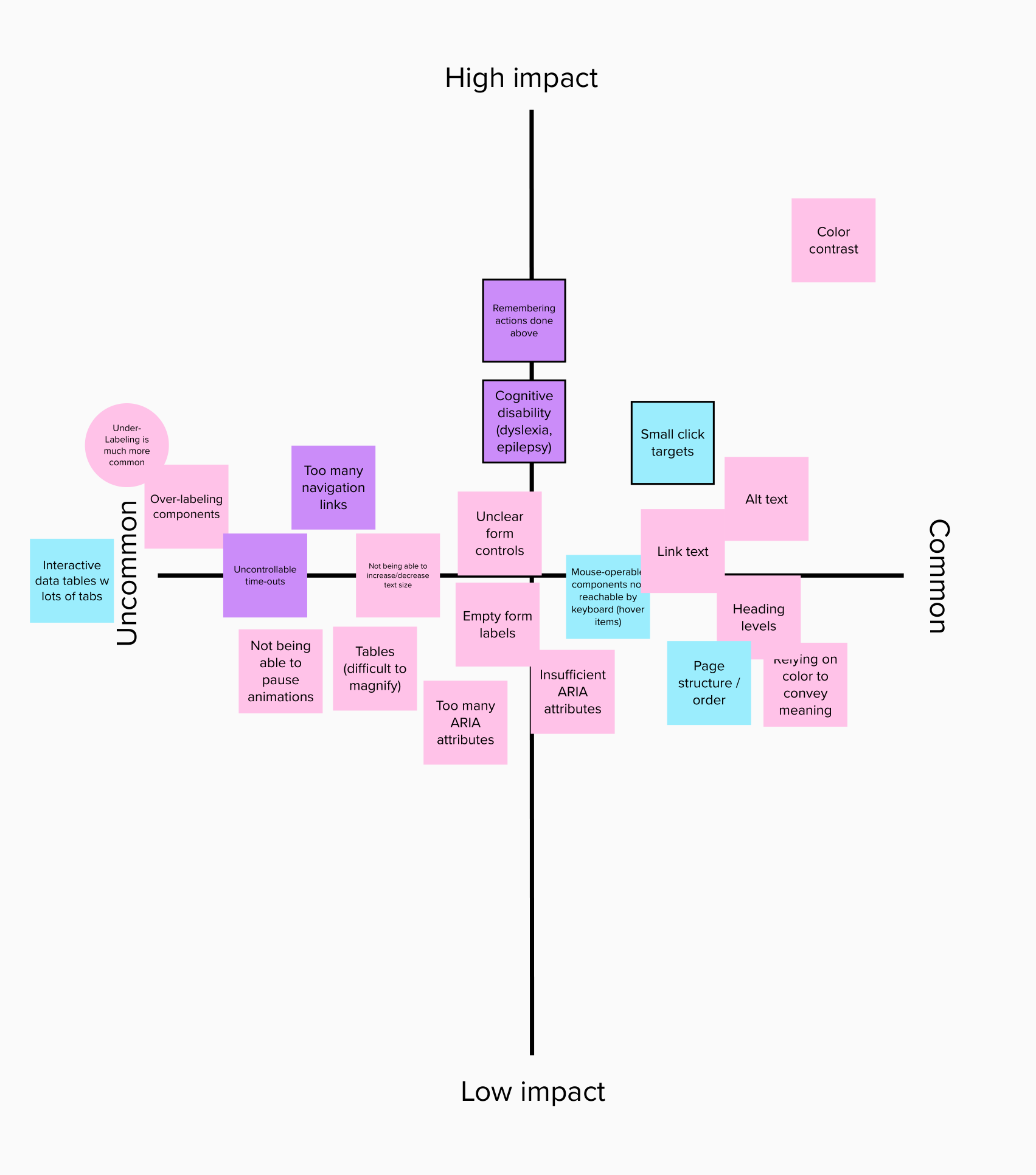
With the help of our sponsor team’s subject matter experts, we brainstormed a prioritization grid that allowed us to discover the most common and impactful accessibility errors.
Example errors we focused on included color contrast, alt text, link text, relying on color to convey meaning, unclear form controls, and empty form labels
Although the original deliverable was a redesigned demo site, our research led us to revise our problem statement.
We needed more than a modernized demo website; we needed to design an experience that demonstrated empathetic use of assistive technologies.
Brainstorming & IDeation
My teammates each generated design ideas that addressed this new objective. Together, we refined those ideas into two concepts, sharing them with stakeholders before selecting the strongest elements to combine for the final solution.
Concept 2
An educational game that gamified the assistive technology experience, also incorporating the Accessibility Checker.
Concept 1
A multi-view reverse accessibility overlay using the new demo site that showcased Accessibility Checker capabilities.
Altoro Mutual Demo Website Redesign
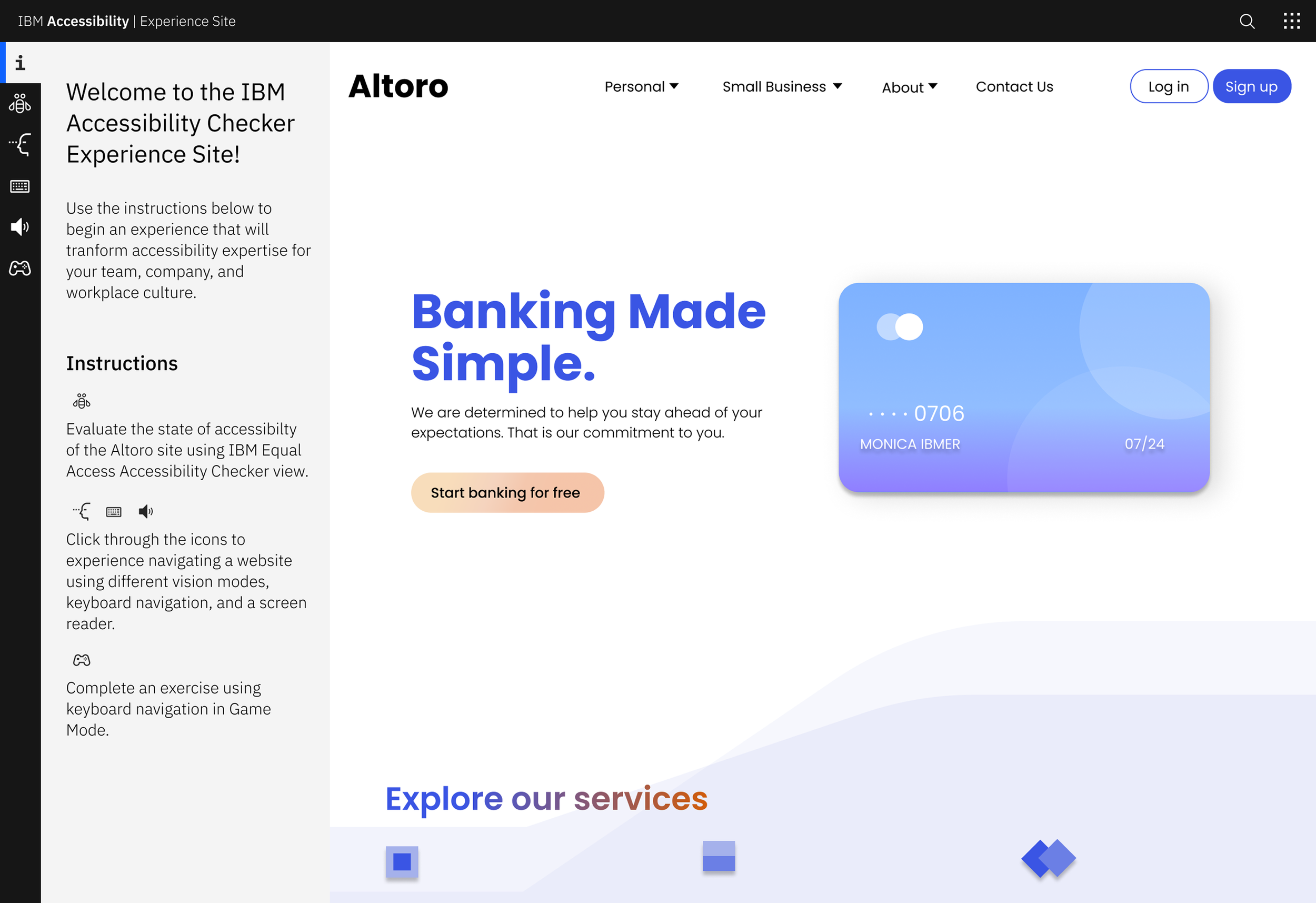
My primary responsibility was redesigning the outdated demo site. My teammates focused on the details of the experience site (which I also contributed to). The current demo site didn’t reflect a modern online banking platform. Guided by Jakob Nielsen’s consistency and standards heuristic, I researched existing banking sites to align the redesign with user expectations and established digital patterns.
I prioritized clean UX and visual design. For example, I used contextual link text to improve screen reader comprehension and navigation (e.g., “Learn more about Loans” instead of “Learn more”).
I referenced the high-impact, common quadrant of our prioritization grid. This was to ground my design in the team's key insights and to focus on the most meaningful user needs (e.g., color contrast, relying on color to convey meaning, etc.).
Additionally, I applied these web design principles:
🎯
Clear purpose & content structure
The redesigned site communicates the types of banking services offered, reflecting the purpose of a modern financial website.
🎯
Simplified navigation
Organized content into three intuitive dropdowns (Personal, Small Business, and Inside Altoro Mutual) to improve discoverability.
🎯
Prominent CTAs
Added clear calls to action like Log In, Sign Up, and Start banking for free to address the original site’s lack of user direction.
🎯
Visual hierarchy
Used size, color, and spacing to guide users’ attention to key information and primary actions.
🎯
Whitespace & simplicity
Reduced visual clutter by streamlining content and layout, creating a more focused, readable experience.
I designed two versions of the site: accessible and inaccessible. These versions allowed the team to run the Checker tool on the inaccessible site to reveal violations and demonstrate the corresponding fixes with the accessible version.
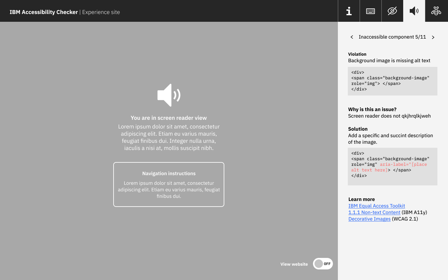
The experience site demonstrated how each version performed with assistive technologies like screen readers, keyboard navigation, color blindness filters, and magnification, highlighting the real-world impact of accessible design.
Solution
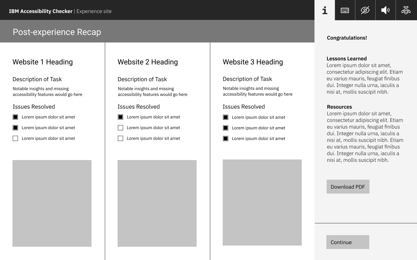
Users can experience a variety of assistive technologies, providing context for accessibility violations and solutions, and external documentation to industry standard accessibility guidelines.
IBM Equal Access Checker View
Preview Checker with inaccessible Altoro Mutual demo site
Download Checker Chrome extension directly
Screenreader View
Navigate demo site using screenreader with or without visual guidance
Keyboard Navigation View
Navigate demo site using keyboard with or without mouse enablement
Game View
Complete timed tasks using keyboard navigation or screenreader to simulate a real life online banking scenario
Vision view
Navigate demo site through vision impairments like colorblindness, light sensitivity, and magnification
Reflection 💡
What did I learn? What would I have done differently?
Accessible design benefits everyone - While researching accessibility guidelines, I came to understand that equal access is for everyone. For example, curb cuts were originally designed for wheelchair users, but are now used by all pedestrians. This principle reinforced that I can’t call myself a designer if I’m not designing for all.
Accessibility must be considered from the start - I always knew accessibility was important, but this project showed me just how often it's treated as an afterthought. When reviewing competitor websites, I noticed late-stage accessibility overlays rather than a built-in solution.
Set and adhere to clear deadlines - We spent too much time in the research phase, which compressed our design timeline and led to unnecessary stress. Defining a clear transition from research to ideation would have helped us work more efficiently and avoid last-minute pressure.
Test with real users who have disabilities - Our designs aimed to reflect real accessibility needs, but due to time constraints, we couldn’t validate them with users who experience such challenges firsthand. It would’ve been insightful to see if our designs were accurate.


